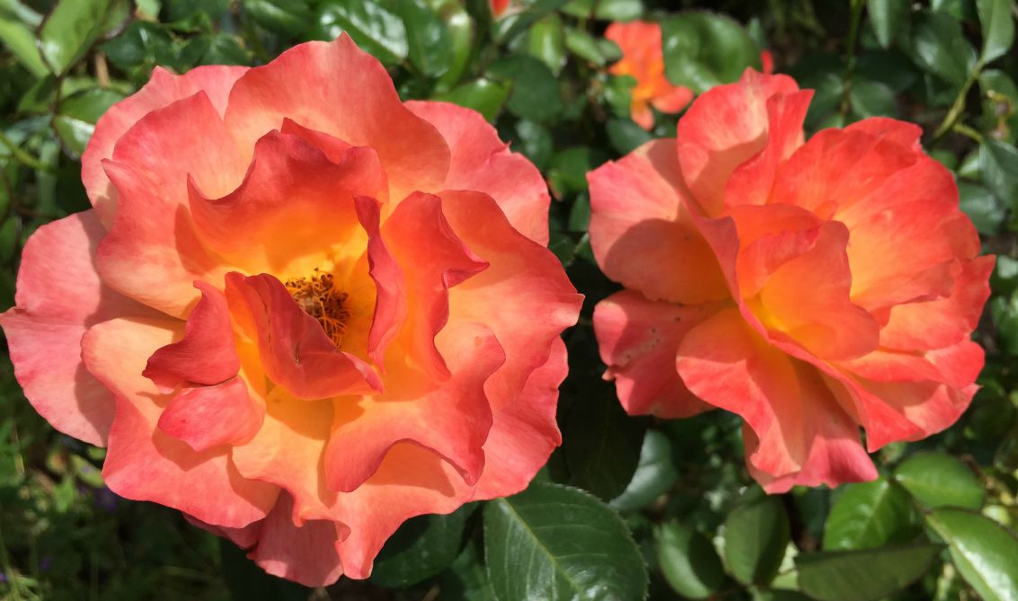
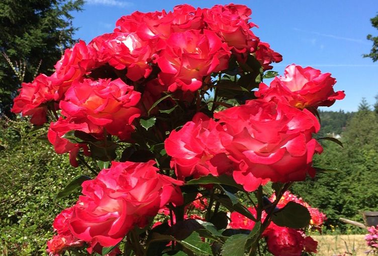
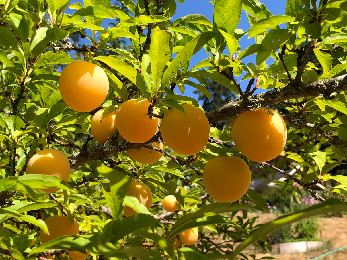
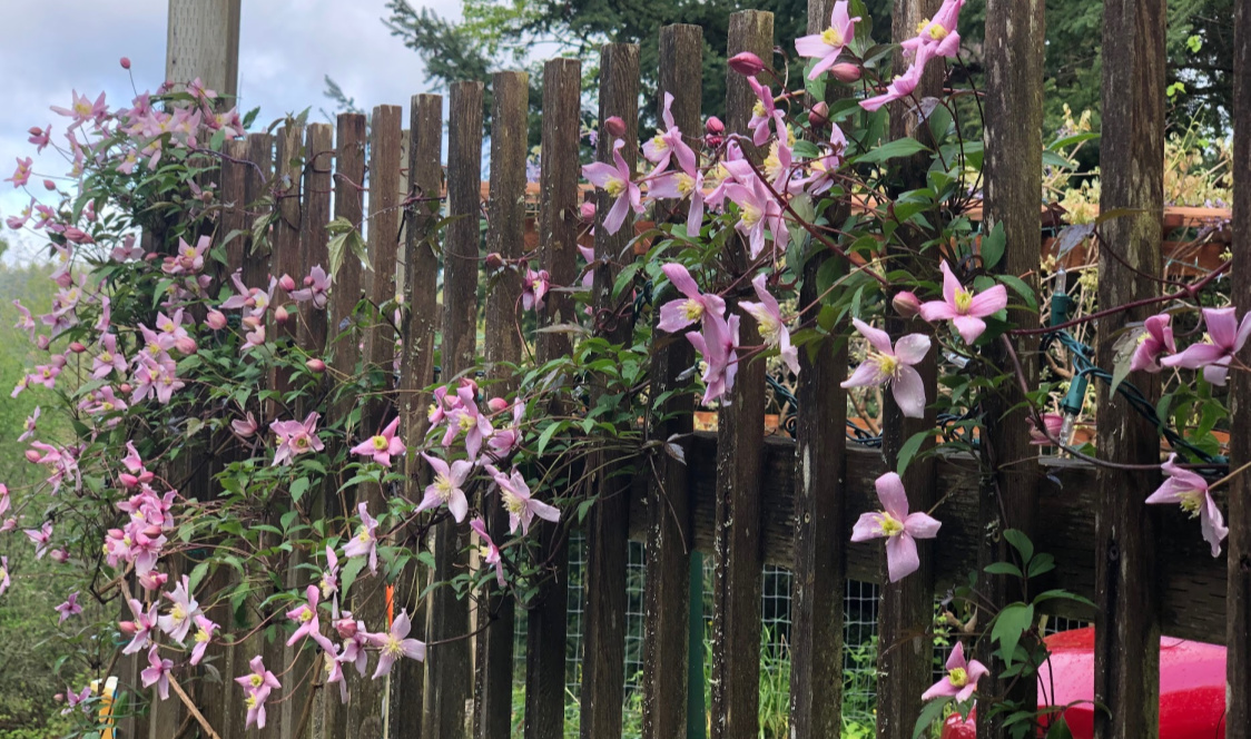
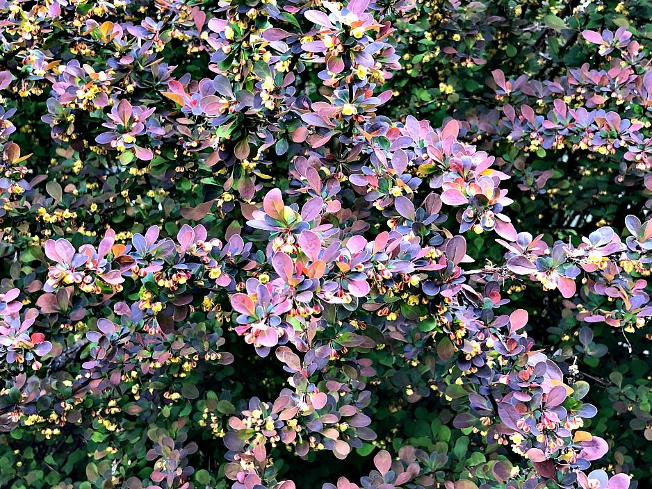
If you have read my blog posts, you know that color is a big motivator for me. I am inspired by colors I see in nature. I react to colors in my work. I actually find colors affect my mood. So it should come as no surprise that a color issue played a big part in a project of mine this month and I felt compelled to figure out what happened.
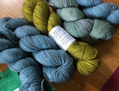
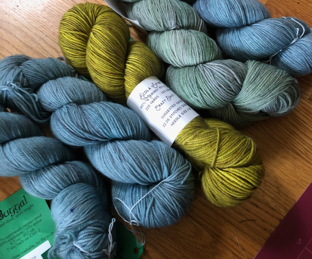
 I had a very specific vision for this project. This is the time of year when I participate in a series of Knit-Alongs, one per month for June, July, and August. I think of July as a red and hot month and I wanted to make something called Pop Spots (Ravelry Pattern). I ordered a bunch of yarns and I knew some would make the cut and some wouldn’t.
 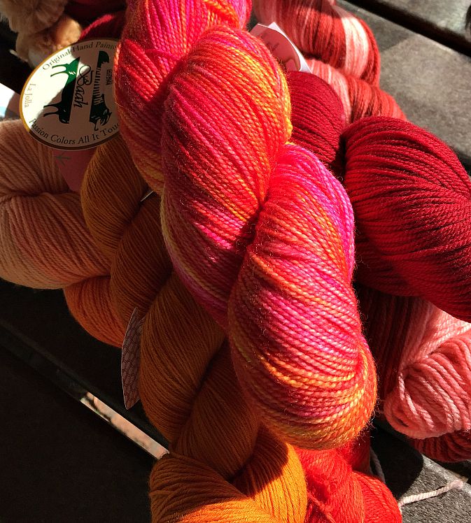 On-line ordering is hard – you can’t really hold the yarns up close to each other in natural light – but I liked everything I ordered so I figured something would work.
As I started the shawl, I found I HATED the colors. It was clear the red and the variegated yarn were NOT playing well together. I put in another quick order for some different reds, knowing the background was a big part of the problem. There are so many kinds of reds and the wrong red is the wrong red. 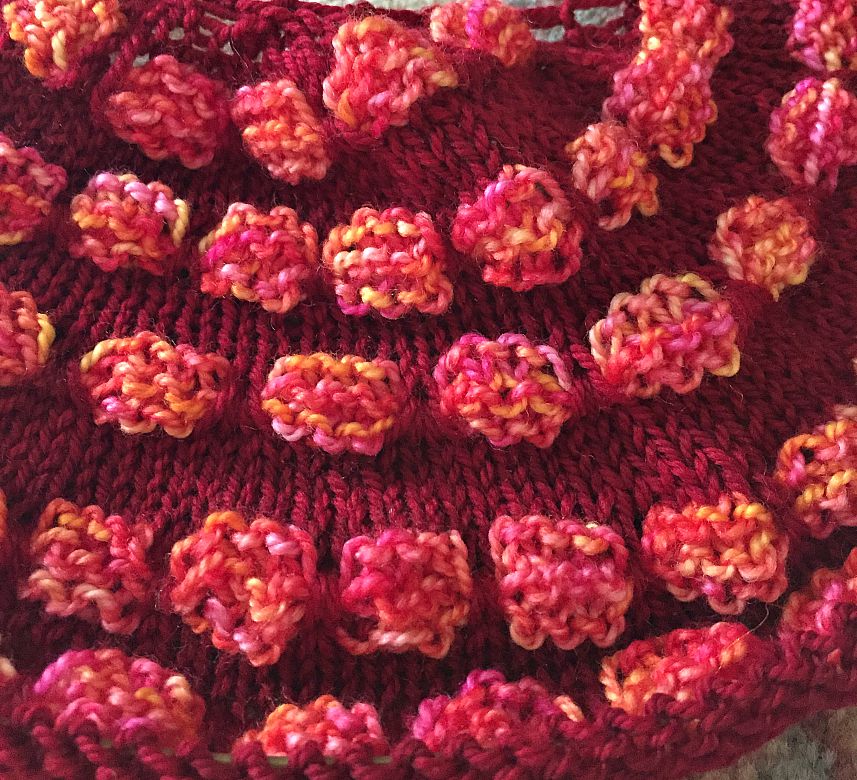 From my favorite color theory book: “Unlike yellow, red has a great wealth of modulations because it can be widely varied between cold and warm, dull and clear, light and dark, without destroying its character of redness. From demonic, sinister red-orange on black, to sweet angelic pink, red can express all intermediate degrees between the infernal and the sublime. Only the ethereal, transparent, aerial is barred to it, for there blue reigns supreme.“*
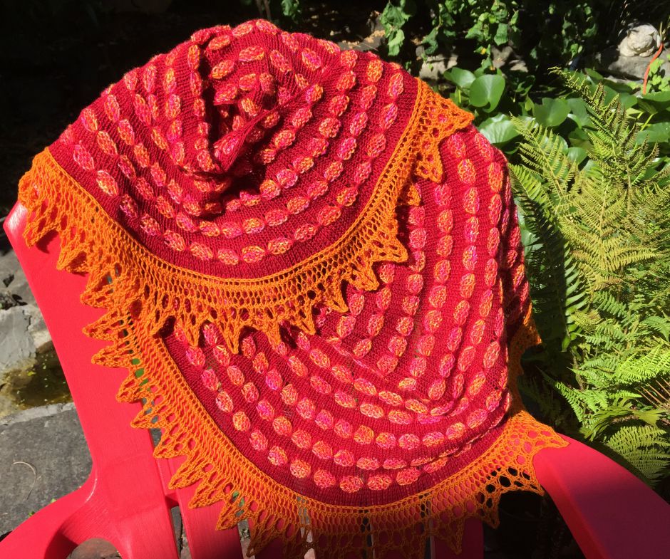
However, once the reds arrived, I realized that really wasn’t the answer. None of them looked any better. So I gritted my teeth and de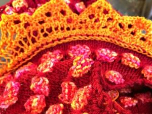 cided to keep going. Usually, that leads to nothing but grief and a piece I can’t stand to have around. This time that wasn’t the case. Why? Because (as I had originally planned) I switched to orange for the lace edging. It was then the real problem became apparent. The red was a really saturated color. The variegated yarn had lots of light in it. Yellow yes, but pink and light oranges and all sorts of shades in between. It was much less saturated and just couldn’t compete. But check out what happens when a little orange (saturated like the red) gets into the picture! That orange just makes everything work. It matches the saturation level of the red and brings out the oranges in the variegated yarn making the shawl a harmonious whole. I said a little “thank you” and knitted the edging like a fiend. The finished product is blazingly bright, but really does have that hot July sun, the rose red of our garden, and a little 4th of July fireworks. Whew!
* Itten, Johannes; “The Elements of Color” (translated by Ernst Van Hagen) John Wiley & Sons, Inc. 1970
Leave A Comment